There are thousands of companies marketing themselves to consumers (both prospective and returning) several times per day, all of them with their own unique logo. Even the simplest company logos have a high amount of thought and time put into them, from logos representing small businesses all the way to logos for colossal corporations. One of the most important aspects in choosing the symbol that will define your company, and thus the self-image that your are presenting to your prospective consumer, is not necessarily the design itself but rather its color.
In the world of advertising, logo design & branding is one of the key pillars of a company’s identity. The amount of thought and work that goes behind the seemingly simplest of logos would boggle the mind of any advertising outsider. Below we will review 20 clever logos that have hidden symbolism you may have not noticed before. Some are obvious, others are subtle, but all of them are interesting to examine. Enjoy!
FedEX
FedEx is the example everyone cites when talking about hidden message logos. The white space between the ‘E’ and the ‘X’ forms a perfect arrow, suggesting a company moving forward and looking ahead. It’s subtle, but now it’s all I see whenever the logo appears..
FedEx Logo
Amazon
The giant online store aptly takes on the name Amazon to convey its wide store directory. This is further hinted by the arrow linking the ‘A’ to ‘Z’ to say that they have everything from ‘A’ to ‘Z’. Which should be able to satisfy you, hence the dual meaning of the arrow being a smile.

Amazon Logo
Uniliver
Unilever is one of the biggest producers of food, beverages, cleaning agents and personal care products. They produce a huge amount of different products and they wanted to reflect this in their logo. Each part of the logo has a meaning. For example: the heart represents love, care and health – feeling good, a bird is a symbol of freedom. Relief from daily chores ? getting more out of life.

Sun
This logo was designed by computer science professor Vaughan Pratt. While not having designer chops, Pratt managed to come up with a ingenious design by making Sun’s logo into an ambigram, which is a typographic design that spells a word out in various directions.
![]()
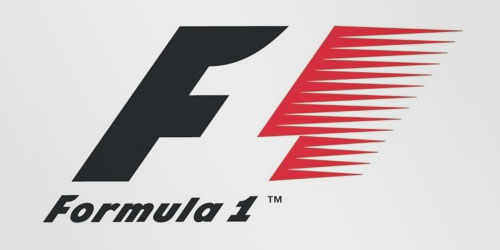
Formula 1
Formula 1 is speedy motor racing, which hasn’t caught on in the US that much. But their logo is universally recognised, and for good reason. The red flares demonstrate the speed – but take a look in the negative space. There’s the “1″ to go alongside the “F”.
NBC
The iconic NBC logo has a peacock in white with five colourful feathers representing each division of NBC (when the logo was originally designed, as there are more now). The peacock is also looking to the right, often associated with looking ahead or forward.
![]()
Egg and Spoon
I’ll admit this took me a lot of work to understand. You see, I thought this was a boring, basic logo at first. It’s just a lower case E, isn’t it? But then you look closer – and the white space (again) looks like an egg in a spoon.
![]()
Northwest Airlines
This used to be Northwest Airlines’ logo before it was retired in 2003. Simply put, the logo is well-designed by making use of negative space to both convey ‘N’ and ‘W’ at the same time. The triangle placed in the ring also suggest the image of a compass, with the triangle pointing in the northwest direction.

Cisco
Cisco is well-known for designing, manufacturing, and selling networking equipment. It is therefore not surprising that they decide to incorporate an illustrated digital signal into their logo.

But there’s another meaning to that digital signal. In fact it looks like an abstract of the famous Gold Gate bridge in San Francisco. By choosing this design, Cisco managed to both convey what they do and where they are located at.
Sony VAIO
VAIO is Sony’s brand line for its laptops. The logo is not just a sylized brand name but refers to turning analog waves into a digital form too. The analog waves are represented in the ‘V’ and ‘A’. ‘I’ and ‘O’ on the other hand can also refer to 1 and 0, which are the two digits used in binary code, the digital.

Le Tour De France
The name of the of the annual and vigorous biking competition isn’t the only feature in this logo. Look closer at the letter ‘R’ and the yellow circle next to it. You’ll be able to see a cyclist in racing position. The yellow circle can also represent the sun to signify that the race takes place during day time.

Apple
The Apple logo is derived from the story of Adam and Eve in the Bible. The bitten apple represents the fruit from the “Tree of Knowledge”.
![]()
BMW
BMW’s logo is a tribute to the company’s history in aviation. The logo shows a propeller in motion with the blue part representing the sky. This is due to the company’s role of building aircraft engines for the German military during World War II.

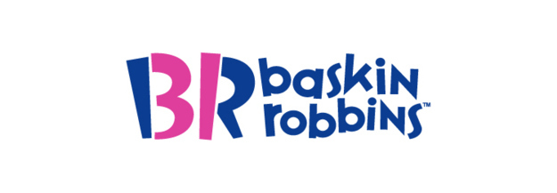
Baskin Robbins
Baskin Robbins offers 31 flavorous of ice cream. The number 31 is hidden in the logo within the letters of B and R.
Continental
The C and O letters at the beginning of the word shape a tyre, which Continental produces.
Families
Families is a Readers Digest magazine. The letter “ili” are transformed to show a simplified and stylized family of three.
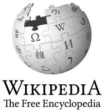
Wekipedia
For those of you who thought it was nothing but a potpourri of various letters without meaning, read on. The logo is an unfinished globe constructed from jigsaw pieces-with some pieces missing at the top—inscribed with glyphs from many different writing systems.
Volvo
The name Volvo literally means “I roll” in Latin. Before making cars, Volvo made high-quality ball bearings presumably well-known for their rollability.

The big “Mars” symbol on the Volvo badge has nothing to do with masculinity. It is a reference to the old alchemical symbol for iron, as Sweden’s massive iron and steel industries were a huge part of the original cars.
Carrefour Logo
This French international hypermarket chain translates to “intersection” in English. If you look very closely you will notice that the big “C” in the white space. The two arrows are pointing in opposite directions.

Hershey’s
Hershey’s Kisses are so fun to give out as you can offer them to people with the quip: “Do you want a kiss?”

Bad jokes aside, turn the logo on its side and you just might spot a (chocolate) Kiss between the ‘K’ and ‘I’.
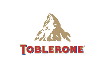
Toblerone
Chocolate again! Toblerone’s logo is lot more complex than Hershey’s. Look closely at the mountain and you’ll be able to spot a bear. The reason for this is because the Swiss chocolate company originated from the city of Bern, Switzerland which is also known as the City of Bears.
LG
The LG logo is meant to be inviting. While at first glance you’ll likely see the letters “L” and “G”, if you look closer you’ll see that the L and G also help comprise a smiling face, with the L being the nose and the G being the outline of the face. The logo is vaguely reminiscent of the famed Happy Mac icon Apple introduced in Mac OS 8. Some also speculate that the LG logo contains a not-so-subtle shootout to Pac Man.![]()
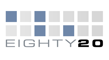
Eighty20
Eighty20 is a business consulting company that leverages big data to come up with market research and develop market insights. And, oh yeah, its logo is charmingly geeky. Each of the horizontal lines in their logo represents a binary sequence. The blue squares are 1’s while the grey squares represent 0’s. So, the top row reads 1010000 while the bottom row reads 0010100. Those two sequences, in binary, represent the numbers 80 and 20, respectively.
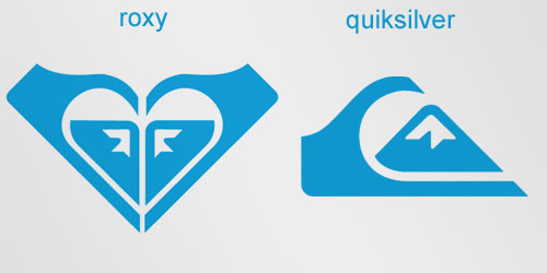
Roxy
Roxy is a company that specializes in clothing and accessories for girls who love snowboarding, surfing? The company is actually a part of Quiksilver. The Roxy logo is made of two Quiksilver logos that form a heart.
Source:
- Compiled from available articles.


Fedex and Amazon are extraordinary. The rest are a little too obvious.
Posted by Yusuf Z Mannan | December 28, 2014, 8:30 pmFedex and Amazon is my personal favorite as well.
Posted by Md. Moulude Hossain | December 31, 2014, 7:48 pmIt’s amazing and fantastic, Today I have gain more knowledge about hidden meaning of the logos.
Posted by Zahidur Rahman Mujib | February 10, 2015, 7:31 pmAll are daam good , some may be extremely good for some and same are normal for some. It’s creative you have to praise all equally so that they get inspired and may produce more best for upcoming days.
Posted by Dewan Towhidul Islam | April 29, 2015, 2:32 pmLogos with hidden meanings are not only clever and entertaining, they also make your audience feel like they’re part of a club and give them the pleasure of having solved a little puzzle. A logo that contains a hidden message makes people take a second glance and remember it.
Posted by Ahmed Mostafa Kamal | July 16, 2015, 6:37 pm